Designing For TV
Overview
You should make at least a few modifications to sites designed for use on a computer-based browser in order to make a site usable on a 10-foot UI.
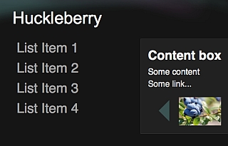
Notice the modifications that have been made between the two YouTube user experiences shown here:
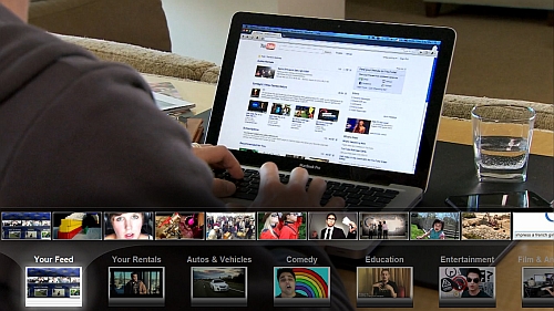
There are several noteworthy changes:
- The sizes of all the fonts and buttons were increased
- The "selected" item or item with the mouse over it is clearly highlighted
- The user can navigate intuitively around the page using D-pad up/down/left/right motions
- Additional padding has been added between all elements on the page
- Darker or slightly muted colors have been chosen to suit TVs that are generally tuned to be brighter
Design Considerations
Viewer's distance from the screenTV viewers sit relatively far from their screens. This distance makes a traditional web page harder to read, cluttered, and more difficult to perform basic tasks like navigating menus and selecting buttons.
When designing a web page for TV, the viewable area should display less information overall, and what's there should focus on a confined set of tasks (even consider performing their desired task automatically or select by default). Try to keep all content "above the fold" and fully viewable on the screen without scrolling down.
- Fonts and graphics on the site need to be larger to account for viewing distance. People sit proportionally farther from a TV than from a computer monitor of the same size.
- To avoid a cluttered appearance on the TV, blank space between elements on the page should be greater. This is typically called white space (or padding) and it's a fundamental aspect of making web content easy to discern and navigate.
- Wide screen displays have more usable horizontal real estate than a desktop monitor, so navigation is better handled from the side (conserving valuable vertical space for content) or as an overlay.
Studies overwhelming show that users prefer fast sites - so it's best to balance any flashy visual appeal with performance considerations. Also, Google TV may not be able to render a page as quickly as your workstation. Before requiring many complex animations for your page to render, test/consider the impact on user satisfaction. Simple, front-end performance improvements (e.g. place style sheets at the top and scripts on the bottom) can be found at code.google.com/speed.
Vertical scrollingVertical scrolling, while fundamental on a desktop browser, may not be as appealing on the TV UI. Scrolling can appear less seamless, and important information may be hidden below the fold if users don't recognize that more content exists off-screen. A better approach is to make use of horizontal layouts and visual transitions between pages of content.
Human interface to browserGoogle TV includes a "remote" that consists of a keyboard with a pointing device for cursor movements. Many users will have this remote on the sofa with them, and may have difficulty with precise positioning of the cursor - like a newbie playing video games. Except that they may not be as patient as a first-time gamer (they just want to watch a video!). Try to keep this user happy. Elements on the page should have large selection surfaces for mouse users. Expanding the surface when the user mouses over an element makes it easier for a user to select the right item on the page. Complex or precise movements with a mouse, such as drag-and-drop actions or drop-down menu selections have a high probability of causing frustration.
The main interface of Google TV encourages the use of the D-pad on the remote to make selections on a screen - it's likely that users will keep this habit even on the web. Web pages should allow every primary activity on it to be engaged from the D-pad: moving through available actions, scrolling through options, selecting items, etc. When navigating with the D-pad, clearly highlight the active item, and make directional movement between items visually and physically logical.
Transitions between pages can also help make D-pad usage more intuitive. For instance, movement of elements on the page in response to actions can be a cue to users on how to "go back" or "reverse" their choice. If a user selects an action that causes a new page to slide in from the right, they can intuitively guess that D-pad left should return them to the previous page. The goal is to allow the user to intuit what will happen on the page based on the "direction" they want to go.
Work To Be Done
Now that you have more of a high-level understanding, let's take stock of what needs to done...
Consider which pages require total redesign vs. simplification
Many video sites have at least 3 types of pages:
- Homepage
- Category page
- Individual video page
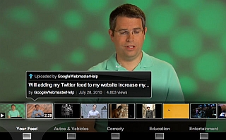
It's likely that some pages, such as your homepage, may need a complete overhaul (e.g. YouTube as shown above). Category pages will hopefully require modification rather than rewrite. And it's expected that individual content/video pages require even fewer modifications.
As a side note, remember that the Google TV browser displays all windows in full-screen. Pop-up windows that are meant to display over or alongside the main page will, on Google TV, instead obscure the main page. Any part of the window without content will simply be blank. Pop-up ads, in particular, greatly disrupt the flow of a website on the TV browser. You can check the user-agent and choose not to show a pop-up for the TV experience.
We'll cover these individual pages later. But the main point here is that it's totally doable! A TV optimized site will soon be yours.
TV Optimization Activities
Rethink layoutRemember that you're no longer dealing with a monitor. The Google TV browser zooms the page to make it pretty for the viewer on their TV screen.
TV Screen
- Understand that the screen contains a fixed number of pixels in width and height.
If your image has the same dimensions as the screen, it will be shown as it is. If not, it will be scaled to fit the screen with a slight reduction in image quality. The native resolution of the screen determines whether the screen is HD ready or not. - The apparent size of elements on a screen changes significantly in a 10-foot UI
For a PC experience, increasing the display size dramatically increases the apparent size of each pixel. But because the viewer is sitting so much farther from a TV, the same increase in screen size yields a much lower apparent increase in pixel size.
To keep the relative size correct, a good rule of thumb is to increase the size of an element (such as an image or font) 1.5x for 720p and 2.0x for 1080p relative to the size of that element in a normal PC browser experience.
For example, a 12 point font would be 18 point in 720p and 24 point in 1080p. - Get to know the safe area:
- TVs have a safe central display area surrounded by a small amount of screen space that can vary in size.
- If you place graphics or text outside the safe area, they may not be visible.
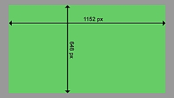
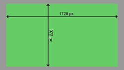
- To be sure that users can see all your interface elements lay out your pages with flexible layouts. At the very least, include at least a 10 percent margin at each resolution:
- 1280x720 resolution. Recommended width is 1152x648.
- 1920x1080 resolution. Recommended width is 1728x972.
- If you must choose one resolution, design for 720p resolution and Google TV will scale it up on 1080p resolution.
- The browser zooms a page to fit the width of the screen (i.e. pages designed for the 720 pixel resolution will work just as well in 1080 pixel resolution).
- If your page uses many images, it's best to create two separate versions through CSS to avoid scaling the images.
- Remember that the Google TV browser is the Google Chrome Browser, which allows you take advantage of various HTML5 features. You can use CSS 3 transformations, local data storage, application caches, new form field types, media tags (audio & video), and much more. Check out html5rocks for more information on HTML5 and its use in Google Chrome.
- If you design your site specifically to fit exactly on a Google TV display, you have the option of disabling auto-zoom. This gives you all the work of sizing the content appropriately for the 10-foot UI, but it can give you greater control of the layout.
- If you only want to design for one resolution (720p or 1080p) and want to manage zoom yourself, design your site to be formatted correctly at the target resolution and then scale it to the other. For example, if you design a 720p site, zoom it up to 1080p with a scale factor of 1.5x. Using even zoom factors (1.5x, 2.0x, etc) will improve performance of your site.
Because using a remote and watching TV is about being brain-dead (just kidding! we just mean "relaxed"), as we mentioned earlier, your TV interface should be simple. No one wants to work hard when loafing on the couch.
Simplify category navigationIf your pages display both top and side category navigation, we suggest removing the top nav. TV screen space is plentiful on the sides, but vertical space is precious.
Even more fancy is to include navigation as an overlay (though we're not covering this further in the quick start guide).
Keep categories selection above the fold. This may require reducing overall categories. If you're optimizing your site through CSS, you can place categories in divs and hide eliminated categories with display:none.
Consider reworking (or at minimum, make sure you test) any complicated AJAX-y nested navigation that involves a lot of subcategories within close proximity.
Limit scrollingCurrently, Google TV and the Chrome browser don't scroll up/down as seamlessly as the desktop experience. At this time, we advise keeping all content above the fold.
- Segments of your page scroll can scroll vertically to reveal new content (i.e. the left nav bar remains static while central area scrolls through content). This will likely have better performance than scrolling the entire page down.
- "Down arrows" to help users be aware that there exists content below the fold, as well as how to reach it.
In a living room experience, the remote is a little clunkier than a mouse and the user is further away. Help the user by highlighting selections and making them big and easy to see.
- Add a hover state to links and buttons to highlight when the pointer has hit its target.
- Make each click target (link, button, and the like) large with ample padding for an expanded target area.
- Elements like close boxes in the corners of pop-ups that are made small to be unobtrusive in a 2-foot UI are either impossible to see or very difficult to click with a mouse from 10 feet.
- Avoid requiring mouse clicks to close pop-ups. For example, some sites designed for the PC will close a pop-up when the user clicks elsewhere on the page; in a 10-foot experience this counter-intuitive. Supply an explicit means to close the window, and make it accessible by D-pad navigation.
- Don't require the user to click on the primary control to make it active. Pages or pop-ups with scrolling elements should either give those elements focus or process the D-pad such that the element can be scrolled without having focus. Requiring the user to click on the element before they can scroll it is obtrusive.
Navigation through your 10-foot experience will be new to most of your users. Providing them with an explanation of how to get around your site will ease user frustration.
Explain:
- The D-pad arrow keys: do they move between pages? open context or navigation menus? and so on.
- The back button: does it move to a previous page? undo an action? close a pop-up?
- Media keys: what does play/pause do? what about skip forward/skip back?
- Other keys: do you have a key mapped to cancel actions or close pop-ups (such as ESC)?
Consider opening a pop-up on your site home page to offer this navigation help so users are given assistance up-front.
Make text easy on the eyesFor TV, avoid lightweight fonts or fonts with both very narrow and broad strokes. Use simply constructed sans serif fonts and apply anti-aliasing to increase readability.
- Google TV currently supports only the Droid Sans and Droid Serif font families.
You can use font embedding techniques to create a more customized appearance. - Limit paragraphs to no more than 90 words.
- Break text into small chunks that can be read at a glance.
- Keep line length at about 5-7 words per line. Never go shorter than 3 or longer than 12.
- Remember that light text on a dark background is slightly easier to read on TV (compared to dark text on a light background).
- Target body text to be around 21pt on 720p and 28pt on 1080p.
- Don't use any text smaller than 18pt on 720p and 24pt on 1080p.
- Add more leading (larger line spacing) for onscreen text than print text.
TV screens have higher contrast and saturation levels than computer monitors. Here are guidelines for working with solid colors:
- Use pure white (#FFFFFF) sparingly. Pure whites cause vibrancy or image ghosting in TV displays. Instead use #F1F1F1 or 240/240/240 (RGB).
- Bright whites, reds, and oranges cause particularly bad distortion.
- Be conscious of various display modes that TVs may have. These include Standard, Vivid, Cinema/Theater, Game, etc. Be sure to test your web pages in all these modes.
- Be conscious of using large spanning gradients, it may result in banding if not properly tested.
- Test your website on lower quality displays which may have poor gamma and color settings.
Tips for individual page design
Homepage
Designing a homepage goes far beyond the scope of a quick start guide :), but still, we can't help but give a few tips.
ReduceYour homepage probably links to tons of cool stuff for desktop users, now remove what doesn't work for TV.
Check your analytics for the least used links. What's the click through rate on "Live Events"? Can it be removed? (Again, these options can also go single-file on the side of the page rather than the top.)
While your desktop homepage may display tons of cool featured videos, perhaps best to scale it down, as shown with YouTube's desktop vs. TV versions.
Keep it above the foldKeep it above the fold. Many web sites have banner ads on the top of the page. On a TV experience, these ads can consume most of the TV viewer's screen, forcing them to scroll down in order to see your content.
Category pageOn category pages, things are a little tricky. Users often want selection, but for TV, it's best if this selection remains above the fold and the navigation simple.
Make sure each option is well highlighted.
When there are more selections than fit above the fold, rather than have the user scroll the page down, consider a left to right selection mechanism.
Individual pageWhen using a TV, once we select a channel, we expect to immediately see the show. So when a user clicks the URL of an individual video on TV, it's probably fair to assume they want the same behavior.
Consider auto-playing the video (and even in full screen).
Make full-screen option prominent and highlighted by default as the first action (if you choose not to auto-play).
Originally published here.
Choose Font Size:
Recently Launched Sites
Cam-Bag.Com
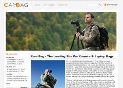
Do you love to take outdoor photographs? Be prepared with one of the Camera and Laptop Bags from Cam Bag. With storage solutions, organization, safety, and security, you will be ready for anything.
Contact Us:
Phone: 647-477-2992Email: info @ CmsBuffet.Com
Helping You Achieve Web Visibility.